Showing posts with label Jennifer Young. Show all posts

All Small Redux - Recap

Say that title 5 times fast.

I should have recapped this on Friday, the day after it happened, because then I would have REMEMBERED more of what I wanted to write about.

So, in brief, it was lots of fun! Saw many friends and met lots of people (well Robert did, he's the one with art in the show and he's more outgoing than I am). Heard lots of great comments about his work, and lots of people told him he needs to keep making more! So exciting!

So let's progress to the photos, 'cause that's the fun part. I have to apologize for the image quality. We were running late and forgot to bring Robert's camera with us, so these were all taken with his iPhone and are thus noisy and not properly exposed. Alas.

Let's start with a portrait of the artist. Doesn't he look happy that I made him pose for this photo?


Here's the two of us together with his art.


And here's a shot of the art "in situ."


Here's our friend Jennifer Young, posing with her artwork.


And here's my favorite piece of hers.


I love that little bunny! So sweet and innocent in that flower. Jennifer does a lot of illustration work that I love. She's also a very talented (and helpful!) tattoo artist.

Here's one of Nell's pieces from inside the gallery:


And from outside:


Yes, that's me. I love Nell's work, how she uses line and planes to create these fantastic new ways of looking at spaces. The photos of these don't do them justice at all. I'd love to buy one of these, but we're poor and I'm pretty sure the kittehs would do their best to knock them off our windows and eat them.

Here's some pieces by other artists. I'll have to see if I can find out who they were made by since I can't remember. First these neat glasses that had images transfered onto their lenses.


I wanted to put them on to see the pictures, like those antique 3-d glasses, but of course, then the image would be too close for my eyes to even focus on it!

Here's me using a magnifying glass to look at some TINY print. That's Katie behind me.


There was also a really nice series of woodcuts. I wanted to get this one for Mike:


But I'm poor, so he'll just have to make due with this grainy photo. (He's got a Belgian Malnois puppy.)

Overall, it was a great show. There was a huge variety of works and just about everything was beautiful and well crafted. So many of the pieces were impressive in regards to how well people could work on such a small scale, and the amount of information or emotion that could fit into such tiny spaces.

Now, for the Gratuitous Pet Photo! Which today is actually a series of photos illustrating what happens when Keira gets to play with her boyfriend, O'Malley.

We start out with this:


A body SLAM! I love how O'Malley's tail looks in this picture. Actually I love his whole body shape. I think it conveys exactly what it would feel like to have Keira body check you. Which is mostly, "holy crap!"

O'Malley retaliates with an "I'll eat your FACE!"


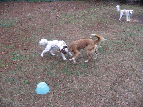
To which Keira says, "Eat this, biatch!"


They both decide that they should work together to crash into the food lady. (Who is clumsy and slow and couldn't get her ass out of the way in time.)


Oliver thinks the whole thing is quite ridiculous. And that I should be petting him instead of photographing those losers.
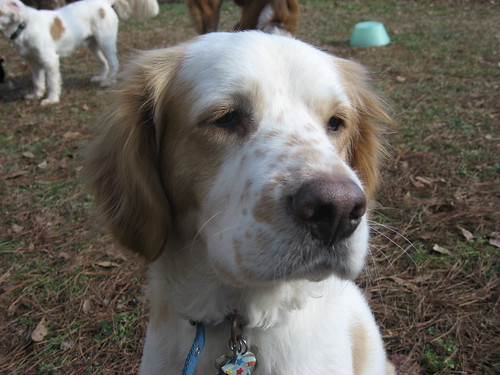


~JML

Practice makes Perfect!

Which means in my case, that I'm not doing so well!

My brother asked me to illustrate a tattoo for him. Awesome! I was really touched that he would ask me to do that. So I start working on it. And working. And working. And…I think you get the idea.

I realized that I haven't done any "real" drawing in probably 3-4 YEARS. I've done some small sketches for work as different logo projects came up and done some for stock work. But most of that ends up refined in Illustrator. And as long as I can get a decent sketch scanned into Illustrator, I can usually refine it from there.

But not this tattoo. It's just looking too "clip arty". I don't have the skills to add all the wonderful detail and shading and personality that a good tattoo artist can.

Fortunately, I remembered that my friend Jennifer "Jenny Bunns" Young is a tattoo artist! (check out her website: www.theapprenticediaries.com and her blog: theapprenticediaries.blogspot.com) She told me to stop tearing my hair out and that since the tattoo artist is going to have to redraw everything anyway, what I've got is good enough to take to them. So I think that's what's happening next. I think Mike is happy with the general details and he's scouting out a good artist.

Here's some iterations. He wanted the tattoo to have 2 elements. A compass and an Ouroboros, or a snake eating it's tail. The compass was representing the Navy (which he's leaving in a couple days) as well as direction or guidance. The Ouroboros (don't ask me how to pronounce it!) represents the idea of your actions coming back to you. Being mindful of your behaviour/actions.

I started with the compass (since it was the easiest!).


We ditched the star and then came to this:


Which turned into this:


I then took a detour over here:


Which I like as it integrates the elements more, but it gets waaay too "dragony" and not enough "snakey", so we nixed this.

I went back to "drawing" and came up with this to help me get the face and some detail.


Brought that BACK into Illustrator and got to here:


You'll notice the compass changed (we could never figure out what to put in the circle after we took the star out) and we added a wave and star design in the center. The water symbolizes change, movement and the stars represent another form of guidance.

The current final version is this:


I've taken out the minor shading I had. We got rid of the clouds; they were too busy. I made the waves less crappy (though now they look like snow covered mountains to me, hopefully the tattoo artist can fix that!) and I've got the compass pointing down into the middle of the waves. I like integrating the elements together like that. The stars suck, again, I'm relying on the tattoo artists to interpret those in a more interesting fashion.

Overall, I'm happy. I'm disappointed with how LONG this has taken me and I really wish I could have done a nice, detailed, illustration. I might still try to do a pencil sketch and see what I can come up with, but I think this is enough for Mike to take and get something nice done.

Now I'm trying to find a sketch group to attend since I've become aware of bad my skills have become!

I'll post a final image whenever Mike gets his tattoo done and I can get a good image of it.

~JML